Horror vacui

Horror vacui is a term that has its roots in Latin, and it means “horror of the void” or “fear of emptiness". This fear of the void, physical or spiritual, has been a part of art and design for centuries, and the concept of “horror vacui” itself comes from art history.
Many historic art movements, like the Victorian, Georgian and Baroque periods, often filled canvases with intricate details. And, because of this tendency, many artists from those eras felt more or less compelled to leave no space untouched, as Christianity sees and represents fullness as connection to God, paradise and heaven on earth, and I would say the same for Islam.
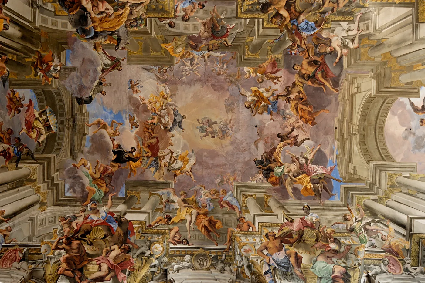
Despite the potential it has to overwhelm the viewer, this tendency for complexity and detail was immensely popular. And for anyone who could actually afford such detailed artwork, then it was a sure sign of prestige and aristocracy. And an ornate, jam-packed artwork signalled both affluence and craftsmanship.
Modernism, as a secular movement, changed this vision into a minimalism searching for universality and globalisation, where artists and manufacturers prioritised simplicity. Many artists would pioneer a really effective use of background, negative space, monochrome colours, and geometrical shapes in art and design; this shift shows the evolving perception of aesthetics over time. Artists and art patrons were paying serious attention to elements in a different way.
While art is different from design. It’s a subject that sometimes confuses the popular psyche of the real world. However, even for user interface (UI) design, there’s a common misconception that empty space is a waste or even a sign of lazy design. The effective use of negative or white space is, in fact, crucial for good design work.
That’s particularly the case for designers of user interfaces, and when designers provide such space, they let their designs "breathe". What’s more, they allow for better readability and comprehension. They’re key parts of improving a website’s or an app’s user navigation.
Designers who fall prey to "horror vacui" can end up with maximalist, visually overwhelming interfaces. Today, even if we can see that people have had enough of minimalism, this can work against the user experience, from a marketing and branding view, as most people are used to simplicity for the last 100 years, and it can harm the web marketing, advertisement and display