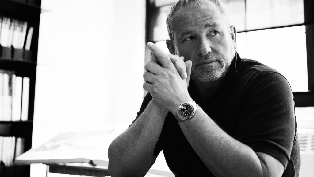
Fabien Baron
Baron & Baron, Inc. is a boutique advertising firm that specialises in luxury fashion, fragrance, and cosmetic products.
Fabien Baron is the founder and CCO of the company.
By combining the ideal elements of print, internet, and television advertising with product and packaging design, he has "shaped the visual identities" of well-known companies, including Calvin Klein, Givenchy, and Fendi, as well as Bazaar and Interview magazines.
Baron Creative oversaw the Burberry relaunch and previously collaborated with Giorgio Armani, Balenciaga and recently ZARA.
Fabien Baron was born on July 5, 1959, in Paris, France, the son of a newspaper designer. Baron went to the École des Arts Appliqués, where he studied design, sculpture and painting.
In 1982, Baron moved to New York and became an art director for Barneys.
In 1988, He went on to reinvent Italian Vogue under editor Franca Sozzani.
In 1992, Baron joined Harper's Bazaar as creative director, working with editor-in-chief Liz Tilberis. He was brought on to revamp the magazine.
According to the UK's The Independent, Baron's work "took Bazaar's competitors by storm" and "created a truly distinctive look, clean, clear, elegant, and modern". It was quickly dubbed "the world's most beautiful fashion magazine".
That same year, he began working with Calvin Klein for what would be the next 20 years as creative director for the brand.
Baron would continue to direct commercials for Calvin Klein, Giorgio Armani, Burberry, Givenchy, Yves Saint Laurent, Fendi and Guerlain.In 2003, He joined Carine Roitfield at French Vogue; she brought him on as creative director to redesign the magazine, and "it became perhaps the most influential fashion publication in the world."
In 2008, Baron was asked to become editorial director and re-envision Interview when Peter Brant took full control of the magazine. Baron's controversial first cover of a "silvery Kate Moss as the devil" in a studded face mask, shot by Mert Alas and Marcus Piggott, garnered attention.
In 2014, He put Kanye West on the cover, stirring up controversy again with a raw blend of dark imagery and religious undertones shot by Steven Klein.
In an interview with Charlie Rose, Baron talked about the magazine: "One thing about Interview that I really enjoy is working with all these amazing people, all these amazing actors, and being able to direct them… and have them on shoots and convince them to do things maybe they wouldn't do otherwise."
The largest brand in fashion and magazines has had its visual language revamped and developed by art and design director Fabien Baron.
Because of his father's accomplishments in journalism and design, as well as his love of luxury and high fashion, he is in a unique position to comprehend how these industries have evolved.
Fabien Baron is at the top of his game and still manages to blend the boundaries between art and business more skilfully than other designers.
“My dad was doing more of the journalistic side of art direction for newspapers, and I was really intrigued by the machinations of it all, the pace. There were no computers at the time, just huge linotype machines that weighed tonnes and used metal plates. There was an adrenaline rush about it all.”
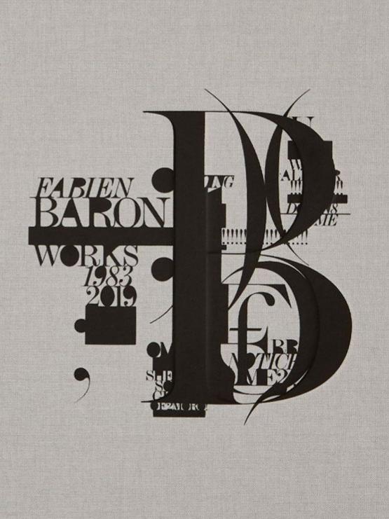
The greatest in modern photography, art, and typographic design were featured in Interview, Bazaar, and Vogue magazines thanks to Fabien Baron's elegant and stylish application of the Bauhaus style.
Large open spaces tastefully interspersed with striking black typefaces define the Frenchman's distinctive aesthetic. Some of his logo designs also resemble ITC Blair, Engravers Gothic, Trade Gothic Extended, and a hint of Helvetica.
Custom typefaces are typically used in graphic design and print sectors, which makes them ideal.
All these brands have worked with or been influenced by Fabien Baron. We can notice that they went through the same innovation and rebranding.
Fabien Baron is arguably the hardest-working man in his field. He has had a significant impact on the industry for nearly forty years, having designed some of the most famous fashion campaigns, rebrandings, and commercials for several luxury fashion and fragrance brands. Risk-taking and altering the impossible require extreme bravery to reach perfection.
Fabien Baron has elevated ZARA to a new level since 2019.
Choosing a classic print serif design for Zara was the polar reverse of what was expected, as every company was moving toward a digital and sans-serif style.
Rebranding their logo to a classic pure serif overlapped letters, like what he used to make for Bazaar, was unexpected.
In order to transform ZARA from a fast fashion company into a couture design house, this step was crucial.
There have also been other improvements, such as a more user-friendly website and superior advertisements in pictures and videos.
Slowly, but gradually, the entire graphic concept has been examined.