Colour Theory

Colour is both a physical phenomenon and an intangible psychological experience.
The way we see and interpret colours, first of all, depends on light, wavelengths, and how the brain processes these signals. Furthermore, sociocultural, personal, and contextual factors play a significant role in how colour affects our emotions, behaviours, and perceptions of the world.
Colour is the result of light, a type of energy that travels in waves. When we see colours, we’re seeing specific wavelengths of light that our eyes can detect. This range of visible light, called the visible spectrum, is just a tiny part of the larger electromagnetic spectrum, which also includes waves we can’t see, like X-rays or radio waves.
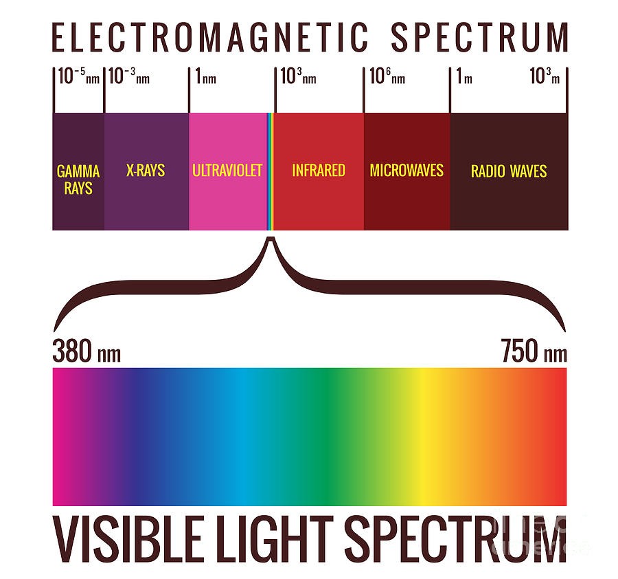
Frequency: Refers to how many waves pass a certain point per second. Higher frequencies (such as violet light) have shorter wavelengths, while lower frequencies (such as red light) have longer wavelengths.
Wavelength: The distance between two peaks (or troughs) of a light wave. Shorter wavelengths produce colours like violet, while longer wavelengths produce colours like red.
The Physics of Colour
There are two main ways we perceive colour: through additive and subtractive colour mixing.
Additive Colour Mixing (Light)
This happens when different coloured lights combine. The primary colours of light are red, green, and blue (RGB). When you mix these colours in equal amounts, you get white light. This is how digital screens like TVs, phones, and computers work: by combining red, green, and blue light at different intensities
Example: When you look at a white screen on your phone, it’s not actually “white” light coming from it; it’s a mix of red, green, and blue light blending.Subtractive Colour Mixing (Pigments)
This occurs when pigments or dyes absorb certain wavelengths of light and reflect others. The primary colours in subtractive mixing are cyan, magenta, and yellow (CMY). When you mix these pigments, they absorb more light, and the resulting colour becomes darker. If you combine all three, they absorb nearly all light, resulting in black. This is the principle behind colour printing.
Example: In a printer, cyan, magenta, and yellow inks are layered to create various colours. When all three are combined, they absorb nearly all visible light, and the paper appears black.
Key Difference: In additive mixing (light), adding all colours produces white, but in subtractive mixing (pigments), adding all colours results in black.
Colour Psychology
Colour psychology explores how colours affect our mood, behaviour, and decision-making. It’s widely used in areas like marketing, design, and therapy, though personal experiences and cultural backgrounds can lead to different interpretations of colours.
Examples:
Red: Often associated with energy, passion, and urgency. It’s used in marketing to grab attention, like in sales signs or “Buy Now” buttons.
Blue: Linked to calmness, trust, and stability. Banks and tech companies often use blue to convey reliability.
Green: Commonly associated with nature, growth, and health. It’s popular with brands that focus on sustainability or wellness.
Yellow can evoke feelings of happiness and warmth, but too much yellow may also cause anxiety. It’s often used in children’s products, casual dining and fast food.
Purple: It represents wisdom, creativity, energy, and the mystical. It was also tied to royalty and luxury for a long time due to its rarity.
Also, the combination of colours can lead to different envies, moods, and feelings; for example, the yellow and red combination is known for stimulating appetite.
While these are common associations, colour perception can vary greatly based on individual experience. For example, while white is often seen as a symbol of purity in Western cultures, it is traditionally worn at funerals in some Asian cultures. Personal experiences also shape how we interpret colours; someone may associate red with danger due to past experiences, even though it’s commonly seen as a colour of excitement.